Tuesday 7 April 2015
Monday 30 March 2015
Wednesday 25 February 2015
Mixcraft and Titling
With the deadline fast approaching, the group has been working hard. We have been working mostly on titling and music.
Using Adobe After Effects, we have been creating simple titles that allow the audience to focus on what is on screen rather than focus on the words too much. We have chosen a simple white colour and a simple font in order to do this.
The music is proving to be more challenging, however we are continuing to preserve with it. Using Mixcraft, we are creating our own version of the American Horror Story opening music as we believe it would fit well with our piece. It is difficult to get the music to match the camera shots, but we will continue to keep trying until we achieve something that works well.
Monday 23 February 2015
Target Audience and Their View of Our Piece
Feeling that we have almost finished our piece (with only music and some titling to complete), we have asked some members of our target audience of their view and how we should improve it.
Many of the comments we received were positive, but as always, there was some room for improvement. There were a few issues with sound transition and distortion as we moved from and exterior shot to an interior shot. Some shots were too long or slightly out of focus. There were also a few other little bits to correct and amend.
In the rest of our remaining time, we will work on the comments presented to us by the target audience before showing it to them again. This will allow us to gather final comments and make final additions.
Friday 20 February 2015
Continuing to Film
Our deadline is fast approaching as we only have two weeks left to edit our final thriller piece. In the past few weeks, we have made significant progress with our project. We have managed to re-film the necessary parts as well as have made significant progress with the editing and it is finally starting to take shape.
However, we did have a few issues filming. During our first session, the camera made focusing sounds that we didn't want, so many of these shots had to be redone. There was also an issue with some of these shots being shaky, due to a un-level surface and a wonky tripod, so we have re-filmed those too.
We will continue to edit until we are happy with our final piece, being critical and analytical about it. We will also ask our target audience their view of the piece so that it appeals to them and meets their criteria.
Monday 2 February 2015
Beginning to film
Our deadline for our thriller piece may be on the 6th of March, but that isn't as long as it seems so we have already begun to film for our final opening sequence.
For every chosen shot, we filmed in several times. Some of this were the same while some were different. This was so we has lots of footage to choose from when editing. We could also cut and put together different shots to achieve what looks the best.
Filming this early means we can go back and re-film and shots that are out of focus, have continuity errors and are not quite right for our film. Being this organised also allows us to spend longer on editing to make sure the thriller opening is the best as we can produce and meets our target audience's needs.
Saturday 24 January 2015
Textual Analysis - Splice
Splice is a 2009 sci-fi thriller directed by Vincenzo Natali. The setting of the opening titles is a fluid-filled womb with the titles growing out of the side or being suspended in the liquid. They were designed by Kook Ewo in an extensive pre-production process. The titles set the tone for the film.
The start of the titles begins with a bird and fish skeleton. These merge into a word (the production company) composed of simple small white letters that contrast with the deep blue background. This is accompanied by discordant music and sliding sound effects as the images change. This noise puts the audience on edge and the contrast between the letters and background allows the audience to focus more on the images rather than the words.
The discordant sounds, similar to something moving through liquid, continue throughout the opening sequence but are layered over with classical piano music. As the titles proceed, the discordant sounds grow louder and eventually the piano can no longer be heard. This suggests to the audience that something will be hidden through the film but will eventually become apparent.
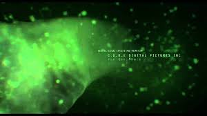
This is an example of some of the images show in the opening titles. The background is black with the green over the top. This is the same colour scheme throughout - dark and murky suggesting that the film will be negative and have dark secrets.. The titles appear regularly on the screen. These ones move along with the green flow giving the impression that action will occur the entire way through the film.
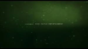 This is similar to the image above. The words are suspended in a murky dark liquid. As they move on and off of the screen, sound effects make it sound like it is moving through liquid. This makes the audience feel on edge as the sound and image is unpleasant.
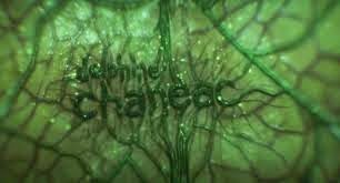
These words are different. This shows that they are more important as they are bigger letters and part of the titles itself (being the same colour) rather than just being layered over the top. The letters appear to be growing out of the membrane of the image making the audience even more uncomfortable and maybe even frighten them a little.
Source used: http://www.artofthetitle.com/title/splice/
Subscribe to:
Posts (Atom)